Bivariate Scatter Plots
- Sean O'Shea
- Mar 22, 2021
- 2 min read
If the name is not familiar, it's likely that you will nonetheless recognize this type of graph. Bivariate scatter plots track the pattern of relations between two variables. Each point placed on the plot is assigned a value on the X axis and on the Y axis. A good example of a bivariate scatter plot, is a graph in which the X axis is used to measure weight, and the Y axis is used to measure height. When there is no direct relationship between the value on the X axis, and the value on the Y axis, there will be a lot of scatter. The points will be arranged in a single line, if the value on the X axis increases at a fixed rate as the value on the Y axis increases.
You can create a bivariate scatter plot in Excel by following these steps:
1. Select the range with your data.

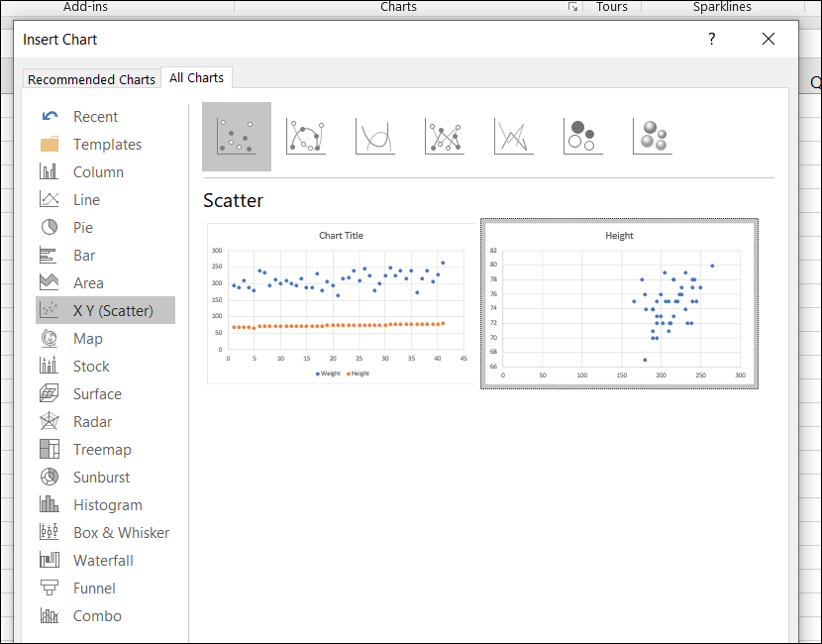
2. On the Insert ribbon, in the Charts section, click on the icon for a scatter plot.

3. Go down to 'More Scatter Charts'.
4. Select an option on the right in the X Y (Scatter) group with height on the Y axis.

5. Resize the chart, and right click on the X axis to set its minimum and maximum bounds to the range for the data set.
6. Right click on the data points in the plot and select Add Data Labels.
7. Change the data labels to the name of each player by selecting data points again, right clicking for Format Data Labels, and then checking off the box for 'Value From Cells'. You will be prompted to select the column with the labels you want to add.

8. Check off the option for 'Show Leader Lines', so you can move around the data labels so they don't overlap. Small lines will connect the labels to the correct data points.
9. Finally, click on the plus sign to the right of the chart and check off the option for trendline.

The result is a complete bivariate scatter plot:


